
Furst Group is the perfect example of a company who wanted (needed?) a RE-branding. As a mid-level leader in the business of executive search for the healthcare industry, they found themselves involved in bigger placements, competing against bigger players, and expanding beyond their healthcare and search offerings... and thus, suddenly in need of upgrading their 20+ year old brand.
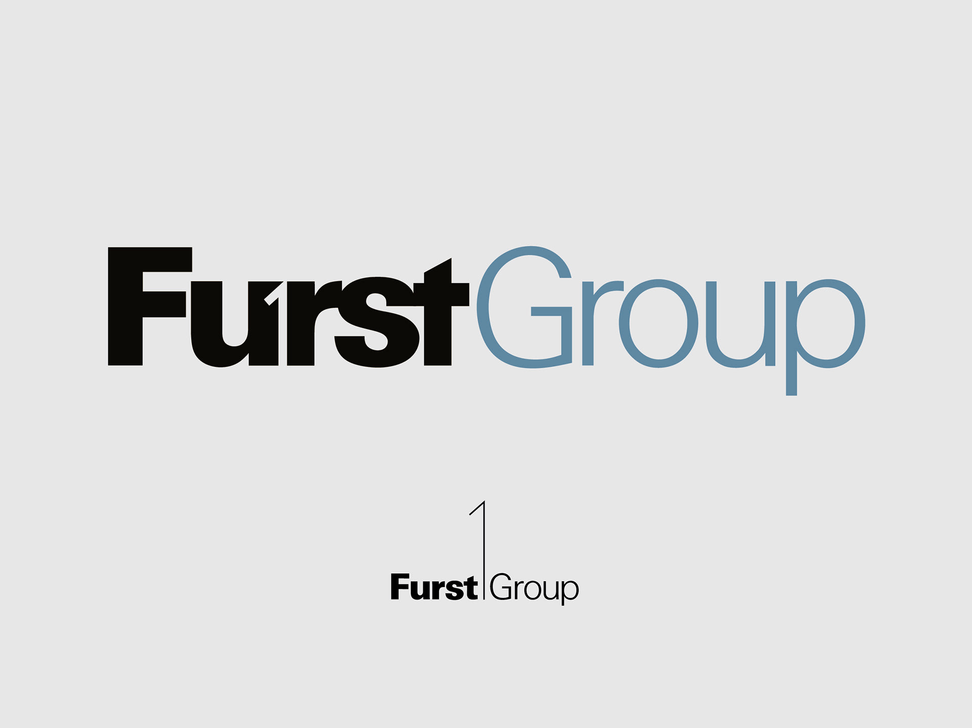
It all started with a refresh – rather than a full redesign – of their corporate logo. Furst Group came to me with a great deal of legacy and equity in their original logo (shown smaller, above). But it also came with the overwhelming challenges of an identity lacking ANY flexibility to appear in many places due to the scale of the “1” vs. the size of the type.
Respecting all that came with their audience’s familiarity of the typographic treatment and the use of the numeral – I developed a refreshed identity that cleverly embedded the “1” into the updated typography, and introduced a teal color that felt professional, historical and allowed FURST to take the lead... just like they do in business. By integrating their well-known 1 into the wordmark, we created far greater scaling flexibilities – a key benefit given their myriad online and print applications.
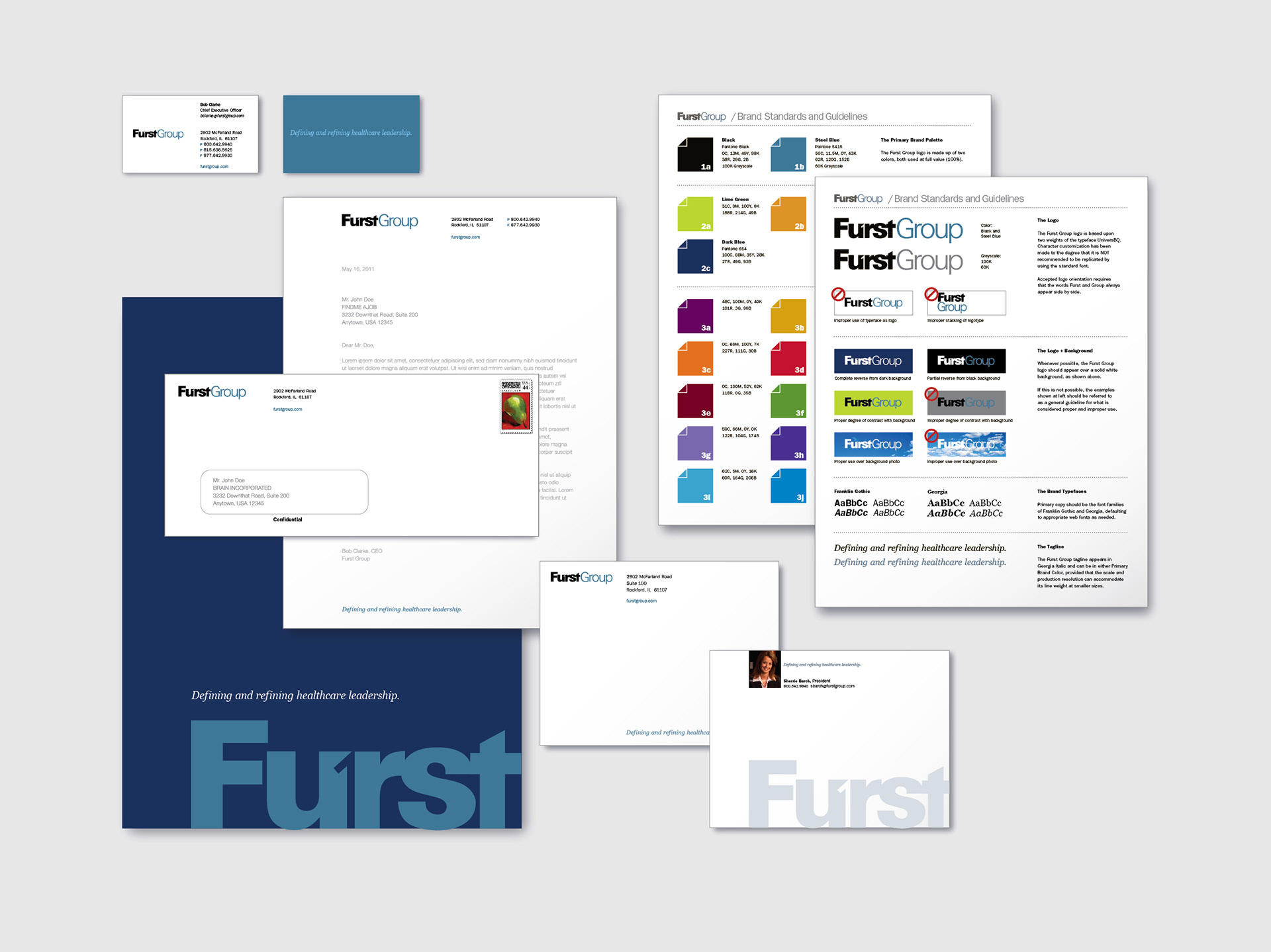
Stationery system and corporate standards.
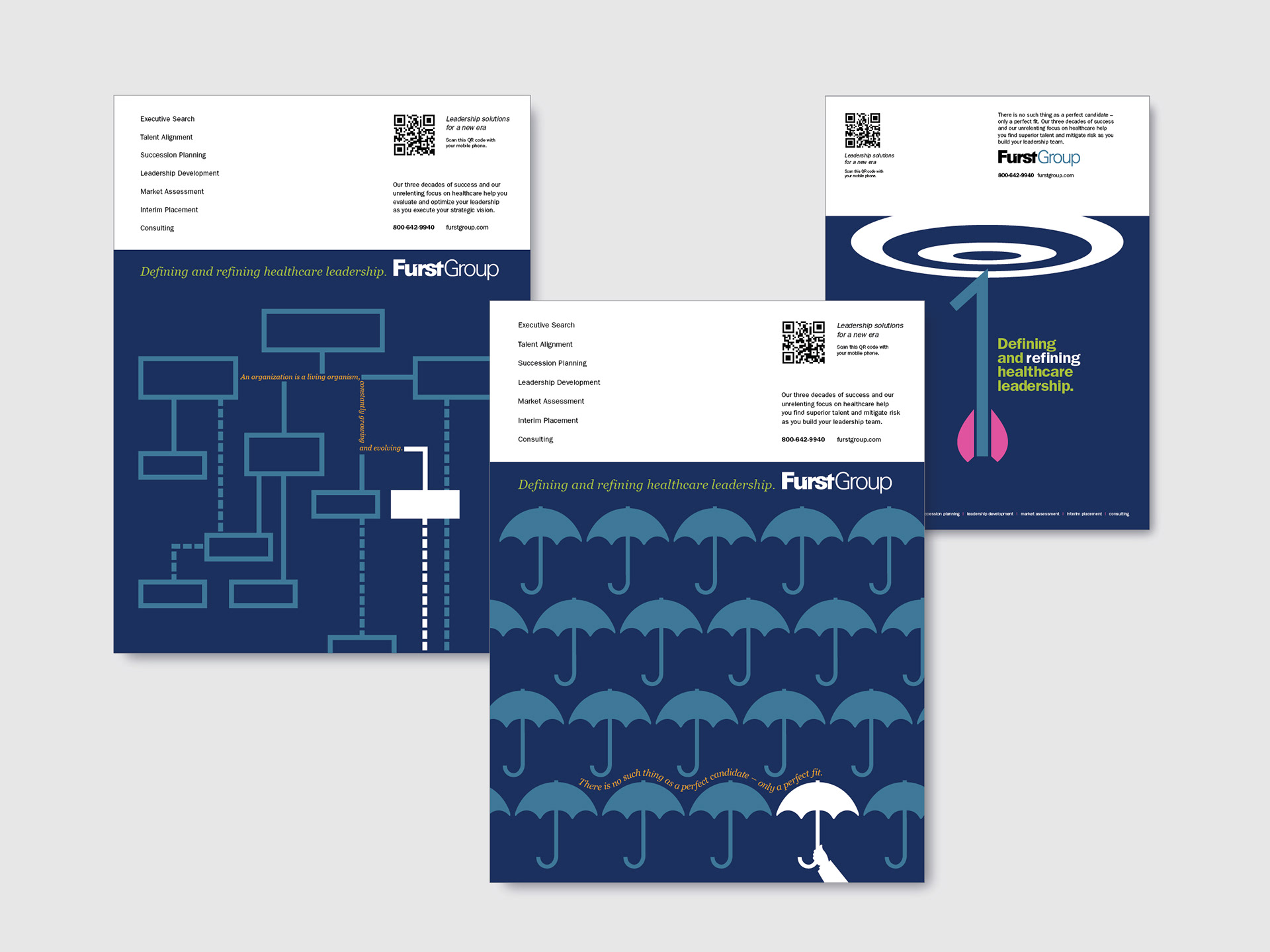
A bold, graphic trio of print ads aimed at illustrating Furst’s strengths for standing out in a very competitive marketplace.
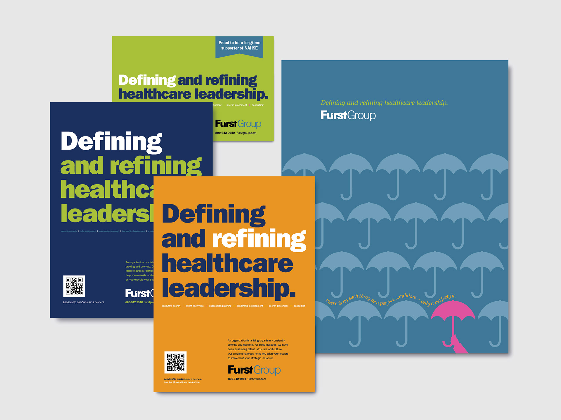
An evolution to bold typography in print ads, and a materials folder design.
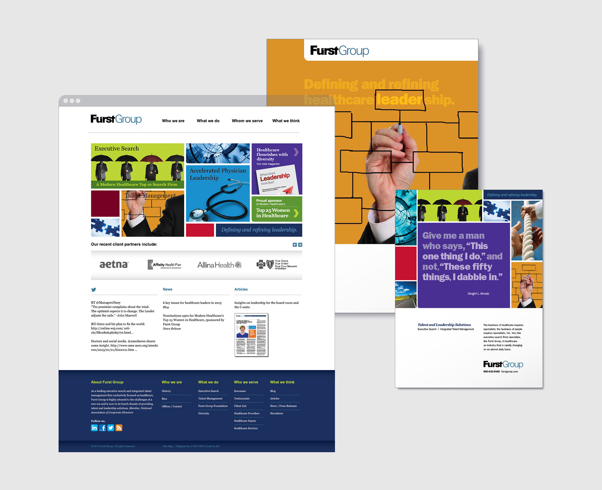
With so much to say and a growing list of professional services, I developed an almost Partridge Family Bus collage style that allowed for more photographic solutions and visual interest. Corporate website, with accompanying marketing and advertisement examples.
NuBrick Partners is the perfect example of a NEW company branding. As a sister company to Furst Group, I was given the chance to build the brand from the ground up – understanding the core shared principles at the foundation, but with a need to play catch up in order to present itself as being just as stable, trusted and proficient.
The NuBrick Partners name presented the perfect opportunity to create a unique identity that took the primary characters of the two-word title and combined them into one very distinctive mark, becoming the foundation of a strong personality viewed at any scale. The N and P share a common weight but are separated by a use of color and an upward, converging negative space that suggests forward movement to an otherwise stable design.
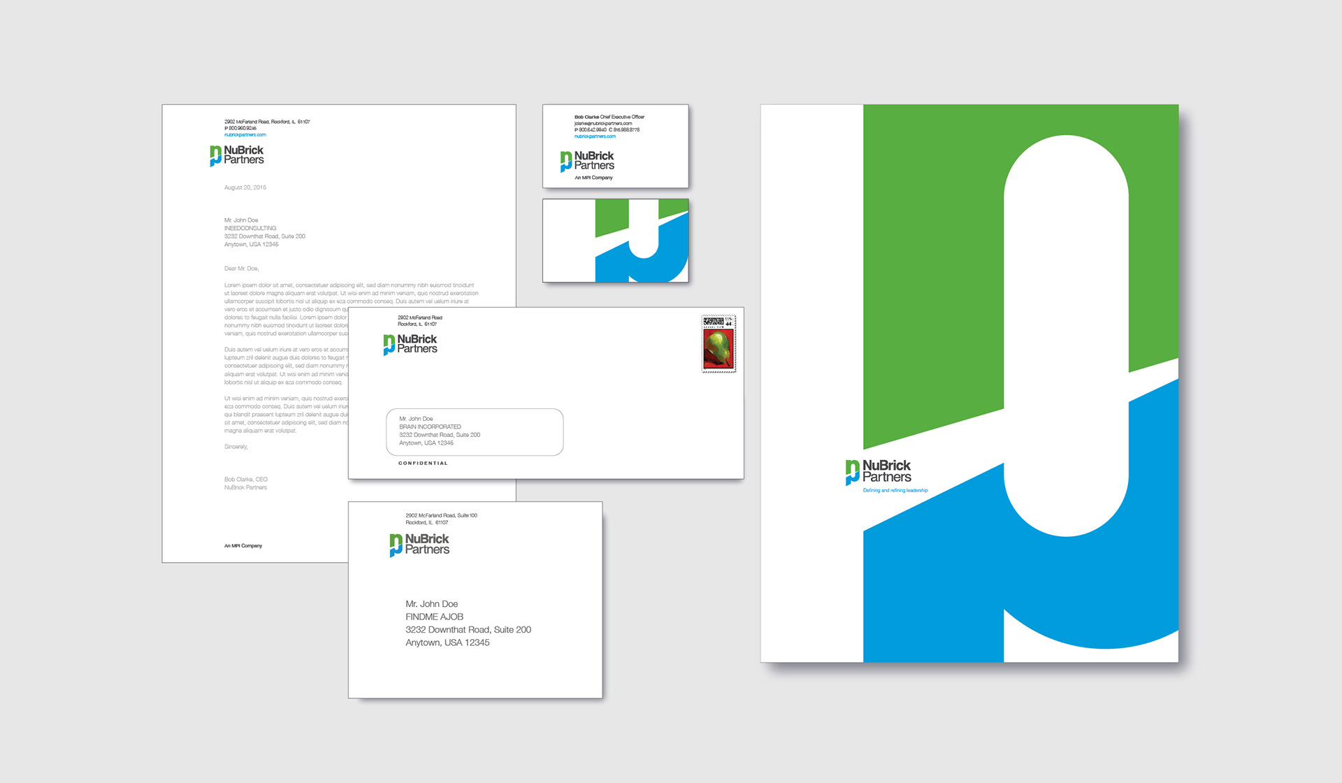
Stationery system.
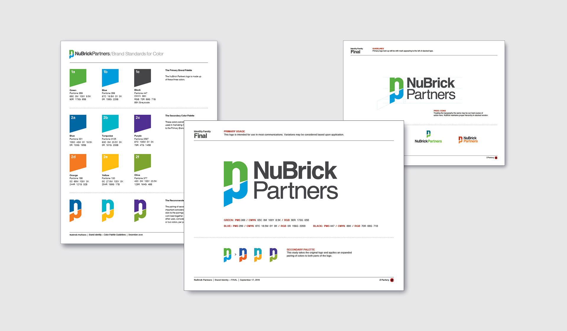
Corporate standards, showing flexibility of lock-up and palette.
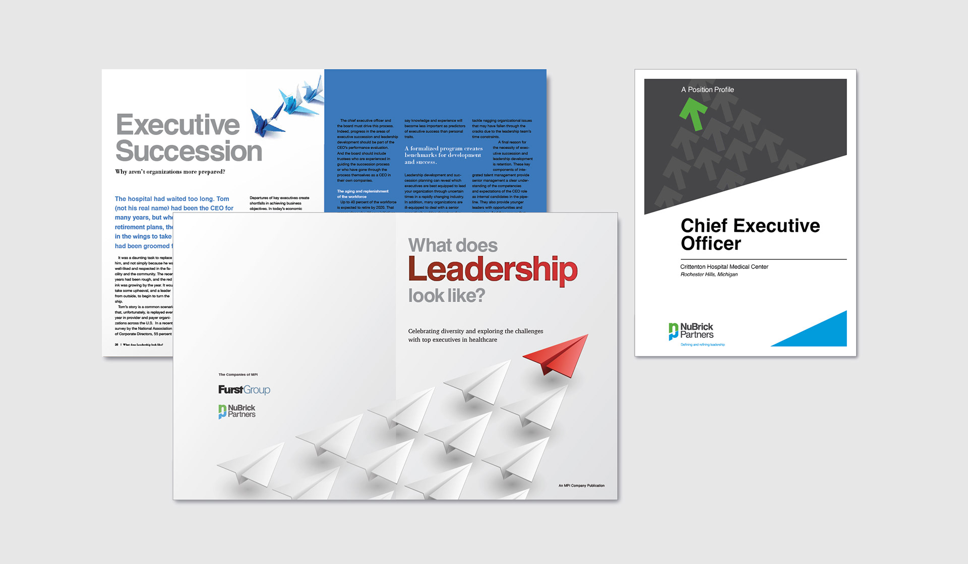
Marketing materials, including those developed in partnership with Furst Group branding.
See other great projects under PRINT WORK.