
This client came to me as a referral from an existing client... the most glorious and beloved of ways to gain new business. With a span of services encompassing interior AND exterior design, I went to work on creating an identity that felt clean, modern and natural in a way that evoked classic styling... but without leaning too hard into a specific design aesthetic. Every designer has a style, but what’s most important is that it doesn’t get in the way of properly reflecting the CLIENT’S personality. And that can be as easily applied to MY work as it is for the business goals of C. Marie.
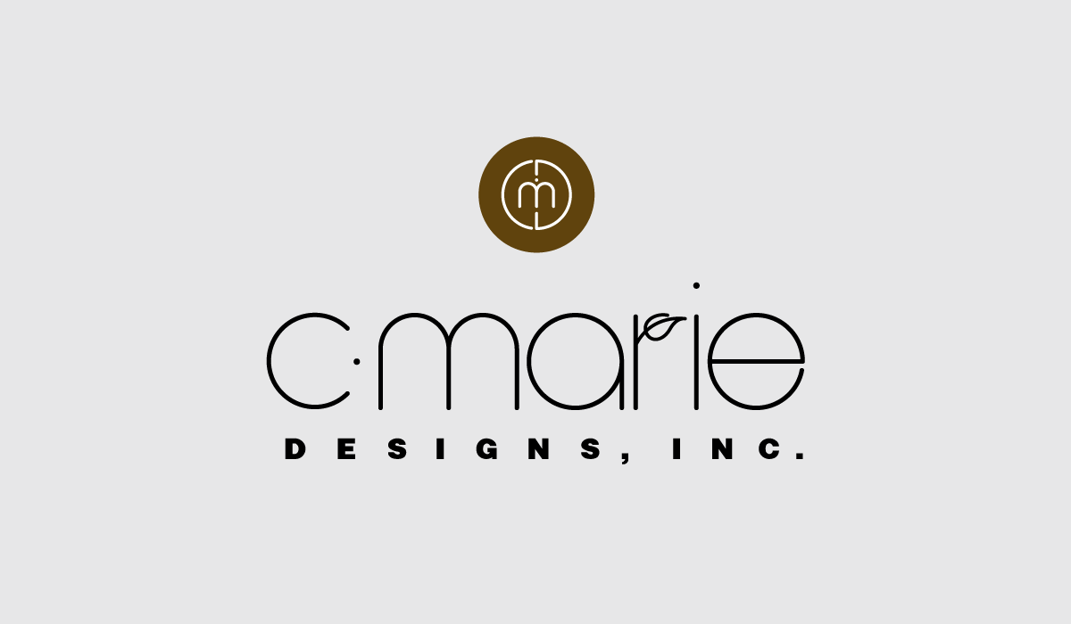
This simple execution was anything but... BUT... it resulted in the creation of a custom font that combined round but architectural letterforms with a nod to the natural elements included in exterior design. And a companion icon formed from the letters C, M, D and a blink-and-you’ll-miss-it tiny dotted i.
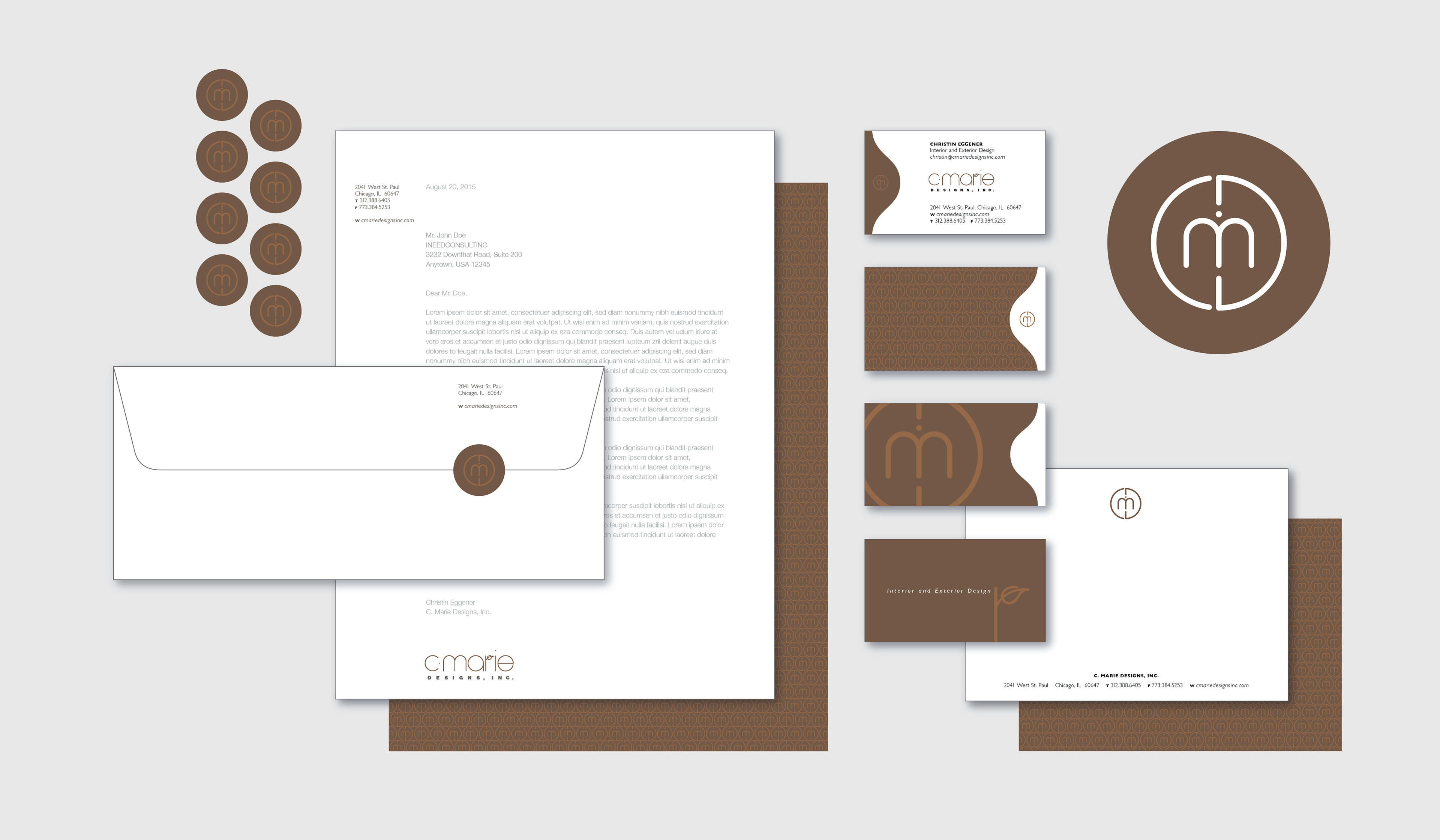
Stationery system, including sealing stickers and a business card with multiple back designs.
See another fun branding project HERE.